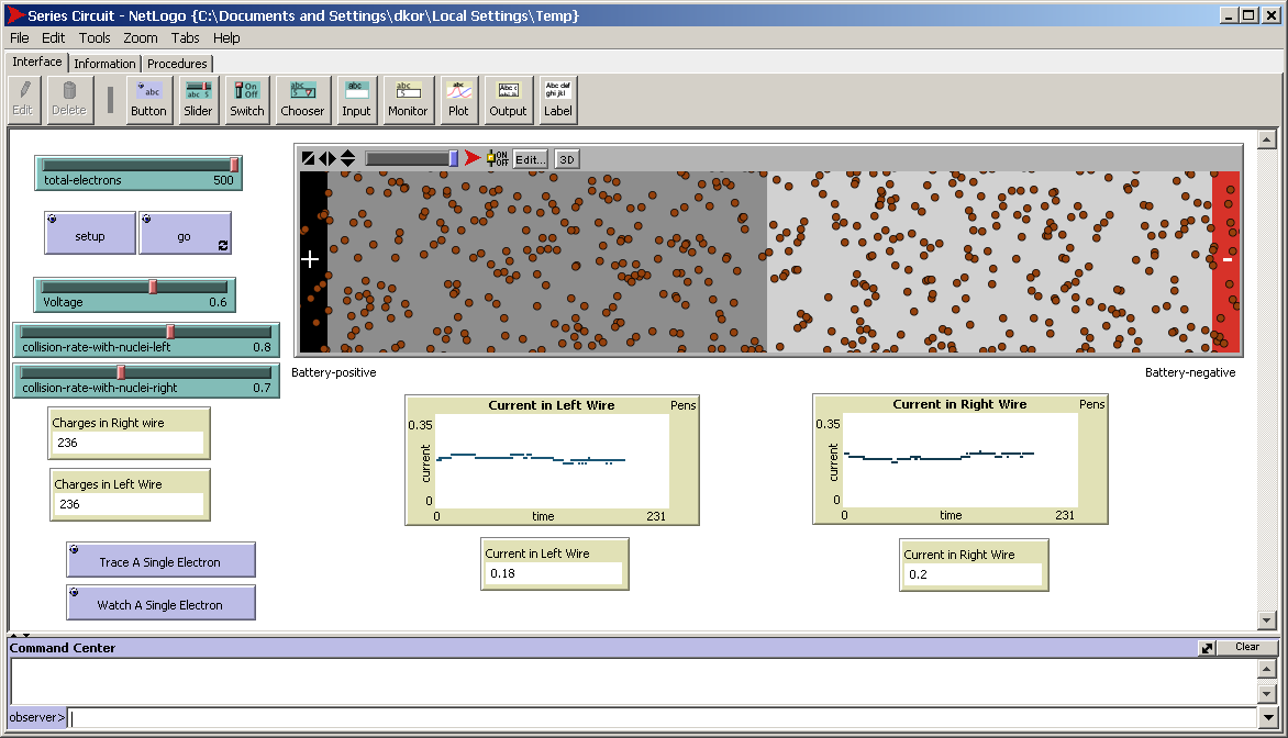
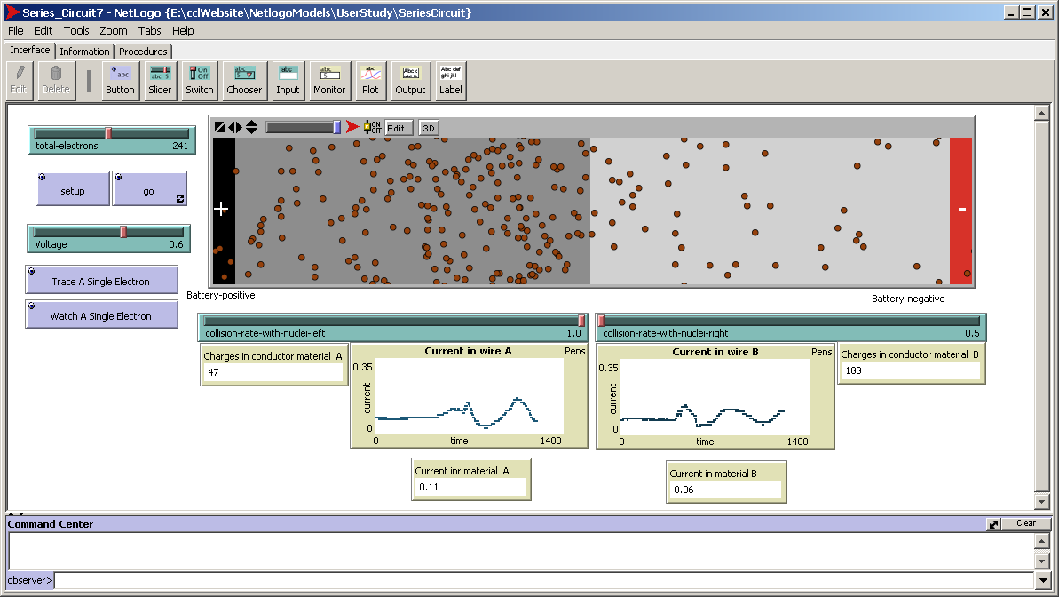
Two different mechanism for selection, closure and hue, are used for distinguishing electrons.
Filled the electrons with red to make them more distinguishable.

Changed electrons to red, and by accident changed the border to gray.
Foreground and Background are not clear, since yellow is used for distinguishing conductor A from conductor B.

Made the electrons smaller, to percieve them as dots and facilitate estimation, the intersection of regions is replaced by an overlaping of points.
Changed the yellow background to two different shades of brown. Brown meant to represent the color of coper.

Made the electrons smaller again, to percieve them as dots and facilitate estimation, the intersection of regions is replaced by an overlaping of points.
Changed the electrons border to black since the electrons where not distinguishable over the red background.

Changed the dark background to brown background., to have less constrast with the electronis and provide a clearer background

Changed the red atoms to orange to make them more distinguishable and less garish

Improved temporal aliasing. This is an improvement in the movement of the electrons and can only viewed when the model is running.

Improved temporal aliasing. This is an improvement in the movement of the electrons and can only viewed when the model is running.


