The items in the table of contents highlighted in yellow are the most important changes in NetLogo 7.0.
Note: in this document the term “clicking” is synonymous with “left-clicking.” Right-clicking will be referred to explicitly.
We interviewed many NetLogo users and one of the most desired updates was a more modern User Interface (UI). In response to user feedback we have made major changes to the UI for NetLogo 7.0.0. We plan to continue modernizing NetLogo in future releases. Your feedback via the NetLogo Forum will help guide UI improvements.
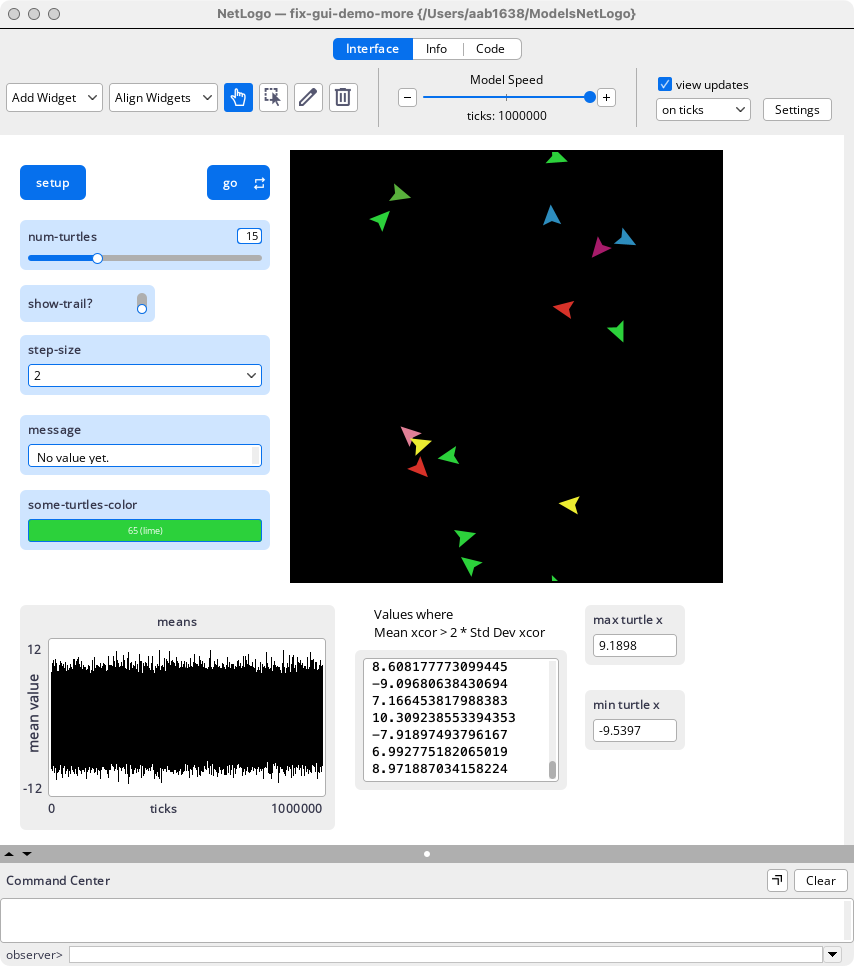
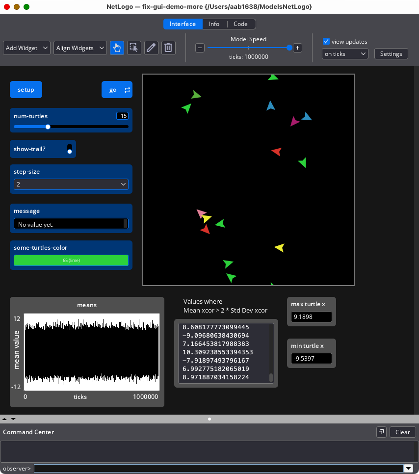
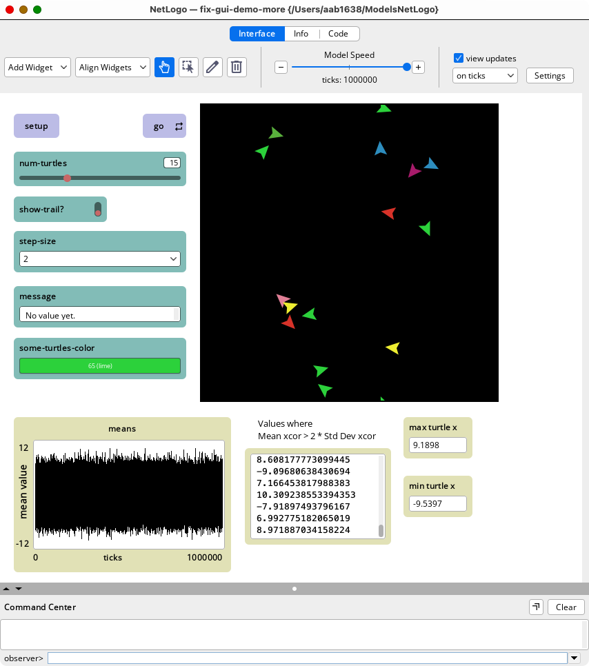
The most obvious change is that interface elements (widgets) have changed in appearance to a modern flat look. They are larger and more legible. A new feature is color themes which affect the appearance of the entire visual interface. They have been designed with visual coherence in mind. Use the Tools->Color Themes menu to select Light, Dark or Classic. For the Classic Color Theme the pre-7.0.0 widget colors are used. In other regards it is the same as Light Mode. The Color Theme also affects the appearance of the Info Tab and the Code Tab.
| Light | Dark | Classic |
|---|---|---|
|
|
|
|
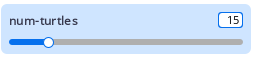
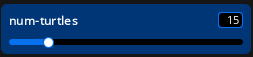
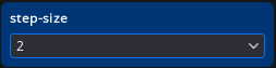
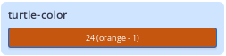
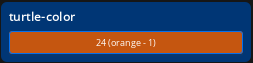
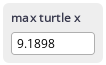
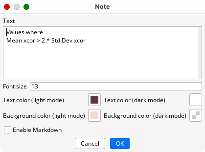
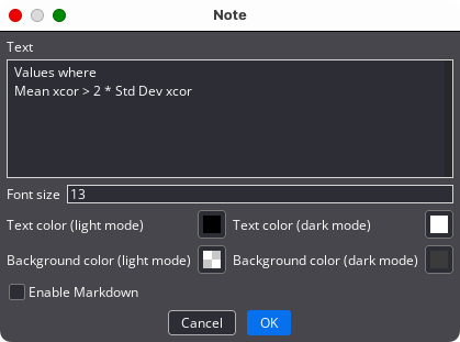
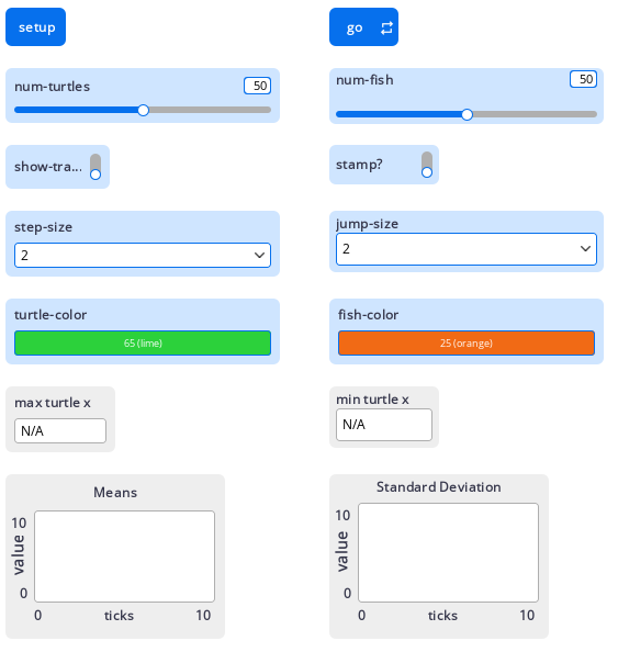
Buttons perform actions when clicked. The input widgets are: sliders, switches, choosers and inputs. The output widgets are: monitors, plots and the output area. Notes are used to add labels, instructions and other information to the interface. Buttons and input widgets are colored shades of blue. Output widgets are shades of grey. Widgets by and large perform as they did in previous releases of NetLogo. A new feature of the slider is a text box in which values can be added directly. A new feature of the Notes is that the user can set both the text color and the background color for both light and dark mode.
| Widget Light Color Theme | Widget Dark Color Theme | Description |
|---|---|---|
| Buttons | ||

|

|
Forever Turtle Button |
| Input Widgets | ||
|
|
Slider – Notice new text box feature |
|
|
Switch |
|
|
Chooser |
|
|
Input (Color) |
| Output Widgets ( Some smaller scale than input widgets) | ||

|
|
Monitor |
|
|
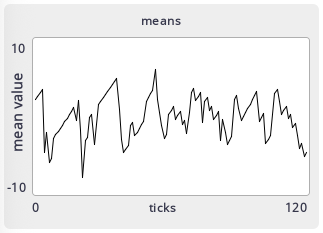
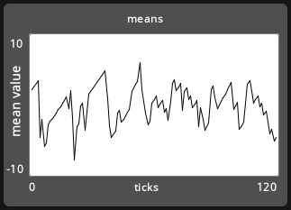
Plot (smaller scale than input widgets) |
|
|
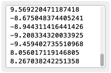
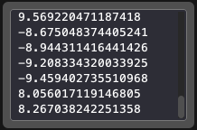
Output |
| Notes (smaller scale than input widgets) | ||
|
|
Note |
|
|
Editing a Note |
In NetLogo 7 some widget sizes have been adjusted for greater readability. The default height of sliders, switches, choosers, inputs, monitors and plots has been increased. The image below shows some widgets in their new sizes on the left, and the original/pre-NetLogo 7 sizes on the right.
When you open a new model, widgets will appear by default in their new (generally larger) sizes. Existing models will open with new style widgets that retain their original size. Most widgets in the Models Library have been converted the new sizes.
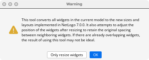
There is a tools menu item Tools -> Convert Widgets to New Sizes, that will make an automatic conversion. Click OK to resize the widgets and change their placements. The button on the left will let you resize the widgets without changing their location. Since redesigning interfaces is an art, more work may be required to make the design meet your personal standards, as indicated by the warning. The Edit -> Undo menu will let you undo all the widget conversions at once.
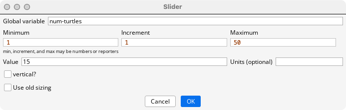
You can also switch the size of an individual widget by clicking the Use old sizing checkbox. This only holds for widgets that have undergone a size change for NetLogo 7. The size of buttons, the output area, and notes have remained the same.
Models in NetLogo 7 have a new format which is extensible and makes it easier to add new features to NetLogo. The new file format follows the XML format , and is compatible for any external tools for working with XML. Models saved with this format .nlogox or .nlogox3d, rather than .nlogo or .nlogo3d. All models going forward will use the new file format. Existing model files, with the extension .nlogo or .nlogo3d, can be opened in NetLogo 7 and will be automatically converted without loss of information. However .nlogox files cannot be opened with previous versions of NetLogo. Any tools users have created that rely on the format of .nlogo files will need to be re-written.
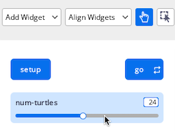
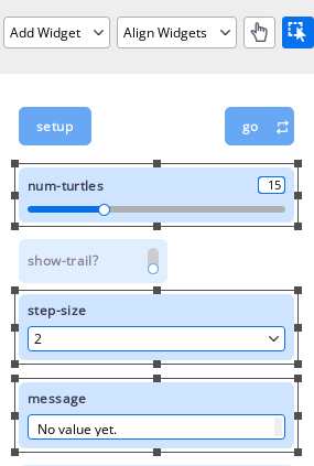
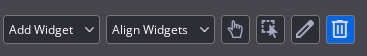
The Interface Panel now includes four tool buttons which control the meaning of user actions. They are the Interaction Tool, the Selection Tool, the Edit Tool and the Delete Tool. The key motivations for these tools are 1) to make user actions more discoverable and 2) to separate actions needed to use an existing model from those used when creating or modifying a model. There are also two pull-down menu tools, Add Widgets, and Align Widgets.
One of the four tools or is always active unless the user is currently adding a widget. The active tool appears darker than the others. From left to right on the Interface Toolbar are the Add Widgets, and Align Widgets pull-down menus, the Interaction Tool (a finger icon) Selection Tool (a cursor with dotted box icon) the Edit Tool (a pencil icon) and the Delete Tool (a garbage can icon).
The Interaction Tool is for making direct use of widgets to run commands and change global variables.
The effect of clicking is widget specific, and is the same as in NetLogo 6.4.
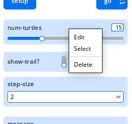
Users can Select, Edit and Delete widgets in interaction mode by right-clicking and bringing up a menu. With Plots one can also Copy Image, Export … and Clear. With the Output widget one can Copy SelectedText and Export …. The View cannot be deleted. The available options are Select, Edit, Copy View, Export View, Switch to 3D View, Inspect Globals, Inspect a patch, and Inspect, Watch or Follow a turtle.
Selection of a widget can be toggled on and off using Ctrl-click (Windows and Linux) or Cmd-click (MacOs). This activates the Interaction Tool.
One option that is not available with the Interaction Tool is using Drag-Select to select one or more widgets. To Drag-Select first press the Selection Tool. However Ctrl+Drag does work with the Interactions tool.
Pressing the Selection, Editing or Deletion icons exits the Interaction Tool. One can also activate the Selection Tool by using Ctrl-Click (Windows or Linux) or Cmd-Click (macOS) on a widget, or by using the Select option with the right-click pull-down menu. Using the Edit or Delete option with the right-click pull-down menu does not exit the Interaction Tool because they are “transient” actions.
These explicit tools are new for NetLogo 7, although they incorporate behaviors associated with certain NetLogo 6.4. icons.
Each of these tools can be entered by pressing the appropriate icon. When one of these tools is active widgets will be faintly dimmed to indicate that they are not currently interactive, and all “forever” buttons will halt. Each can be exited by selecting a different tool icon. The Esc key will return you to the Interaction Tool. Moving the focus to another context such as the Command Center, the Info Tab, or the Code Tab will activate the Interaction Tool.
This menu allows users to add widgets. This tool is entered by clicking the “Add Widget” dropdown menu on the Interface toolbar and making a widget selection. The movement of the mouse is accompanied by a light image of the element and there is no cursor. Clicking places the element in its current location. Right-clicking allows you to change the widget type. You can also add a widget by right-clicking anywhere in the white background. This brings up a menu, allowing you to select the widget type and place the widget.
Once you complete the add widget action by clicking “OK” to insert the element, or “Cancel” to abort the process the Interaction Tool is active.
This tool allows users to select and subsequently edit or move an element or change its size. Enter this tool by pressing the “Selection Tool” icon on the Interface toolbar (cursor with dashed rectangle).
Press the “Selection Tool” Icon. Widgets will dim. Clicking on an interface element selects it. A line border with square handles will appear around the element to show it is selected. This will be black for the Light Color Theme, and grey the Dark Color Theme. A widget can also be selected by dragging a rectangle around it with your mouse or by right-clicking a widget and choosing Select from the menu. You can toggle selection and deselection by using Ctrl+click(Windows/Linux) / Cmd+click(MacOS) an widget Any method of selecting one or more widgets will activate the Selection Tool. Clicking the background area will deselect any selected widgets. Dragging the mouse will move all selected widget(s). You can also click and drag an individual widget before the selection markers appear.
You can select multiple interface elements at the same time by including them in the rectangle you drag. Additional elements can also be added by using the alternative methods.
An individual selected interface element can be selected by pressing Ctrl+click(Windows/Linux) / Cmd+click(MacOS) or by right-clicking the element and choosing “Unselect” from the popup menu. To deselect all selected interface elements, click the mouse on the white background of the Interface tab. The Selection Tool will remain active. Any method of choosing a different tool will exit Selection tool.
The following actions require that at least widget is selected:
Select one or more widgets, then drag with your mouse to the new location. You can use the arrow keys to move the widgets a small increment right, left, up, or down. Using shift plus an arrow key increases the increment. If you hold down the shift key while dragging, the elements will move only straight up and down or straight left and right. The items remain selected.
Select the interface element, then drag the square “handles” in the selection border. If multiple elements are selected the handles can be dragged one at a time, and the items remain selected.
The following actions require that two or more elements already be selected.
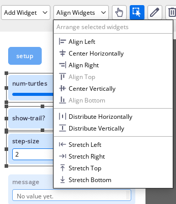
If more than one element is selected, clicking Align Widgets will display a popup menu of alignment choices. Dragging the mouse to select an option and releasing it will perform the alignment. The items remain selected.
The Align Widgets menu also has options for distributing widgets vertically or horizontally. The items remain selected.
The Align Widgets menu also has options for stretching widgets to match other widgets to the right, left, top or bottom. The items remain selected.
The actions of aligning, distributing or stretching will not be completed if they would create a new overlap of widgets. Not completing an action may result in unexpected behavior, but protects users from other unexpected behavior, such as one widget becoming completely hidden behind another.
This tool allows users to change the characteristics of an interface element Enter this tool by pressing the “Editing Tool” Icon on the Interface toolbar (a pencil).
Editing: Press the “Editing Tool” Icon and click on an element to edit it. When the user completes editing a widget, the Editing Tool remains active. Clicking another widget will edit it.
If an element is already selected you can press the editing icon to activate Editing Tool and open the widget for editing. Clicking the Edit icon when multiple items have already been selected deselects the items, and enters the Edit tool. You can also begin editing by double-clicking a selected element, or right-clicking an unselected element and choosing “Edit” from the popup menu.
This tool allows users to delete interface elements. Enter this tool by pressing the “Deletion Tool” icon on the Interface toolbar (trashcan) After an element is deleted the user is still in Deletion Tool and ready to delete more items. The view cannot be deleted.
“Deletion Tool” Icon and click on an element to delete it. You can also select the element or elements you want to delete, then press the “Delete” to delete
Press the widget. You may also delete an element by right-clicking it and choosing “Delete” from the popup menu. If you use this latter method, it is not necessary to select the element first.
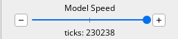
The speed slider is located in the Interface Toolbar. You can make the model run faster by moving the slider to the right, or by clicking one or more times on the “+“ button, and slower by moving the slider to the left, or by clicking one or more times on the “-“ button. Twenty clicks on the “-“ or “+“ button will move the slider thumb from the center to its minimum or maximum rate. The increase or decrease in speed is not linear with the amount the slider knob is moved.
NetLogo 7 introduces a new, more powerful way of selecting colors, which replaces Color Swatches. As was the case previously there are four different contexts in which colors can be selected: from the Tools menu, from a Color Input widget, when selecting a plot pen color and when editing a Note. The ways in which the versions differ involve whether a selected color can be copied and or “picked,” whether transparency is allowed, and what forms of input and output specifications are allowed, as will be described later.
For information on the different ways colors are represented in NetLogo see the Colors section of the NetLogo Programming Guide. The NetLogo primitives for working with colors are approximate-hsb approximate-rgb base-colors color extract-hsb extract-rgb hsb import-pcolors import-pcolors-rgb pcolor rgb scale-color shade-of? wrap-color. The Palette Extension offers additional ways to work with colors.
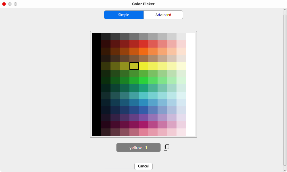
All versions of the Color Picker have two tabs, Simple, and Advanced. The Simple tab allows users to pick a color from a rectangular grid. This is analogous to the Color Swatches dialog, although it is more visually streamlined.
The Simple tab of the Color Picker in the Tools menu has buttons to allow the user to copy the color (icon to the right of the grey rectangle), or exit the dialog (cancel).
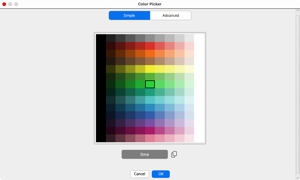
As shown below Simple tab for the Color Input adds a blue ‘OK’ button to the right of ‘Cancel.’ Choosing ‘OK’ changes the Input to the selected color, exiting the dialog. ‘Copy’ puts the NetLogo Color number corresponding to the selected color in the clipboard. It can then be copied to the Code Tab, or any other text area. The dialog remains open. Cancel closes the dialog without changing the color input widget.
When editing a Note, there are four buttons that can be clicked to open a Color Picker.
The ‘Simple’ tab of the color picker is the same, regardless of context. The ‘Advanced’ tab allows different output formats, depending on the context.
The Advanced Tab allows a much more nuanced way to choose a color.
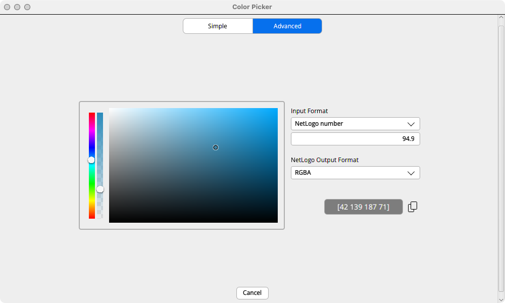
The rainbow slider on the left allows users to select a hue. The slider to its right allows the user to select the transparency of the color. By default, the color is fully opaque, and the knob is at the top of the slider. The little circle below these sliders indicates the transparency by the visibility of the underlying pattern. There is a little circle in the rectangle that lets you explore variants of a color. Moving from it from left to right (horizontally) makes the colors increase in saturation. Moving it vertically from bottom to top increases the ‘lightness’ of the colors.
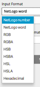
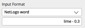
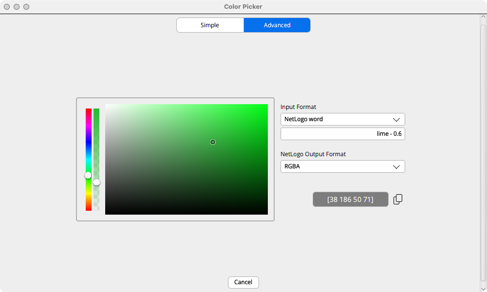
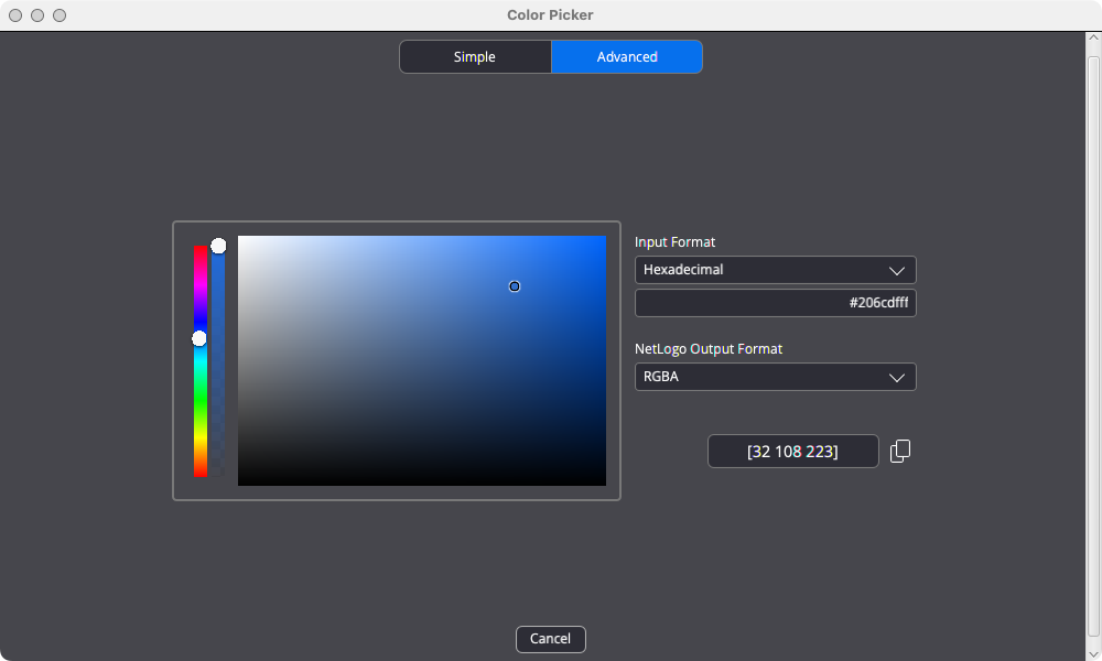
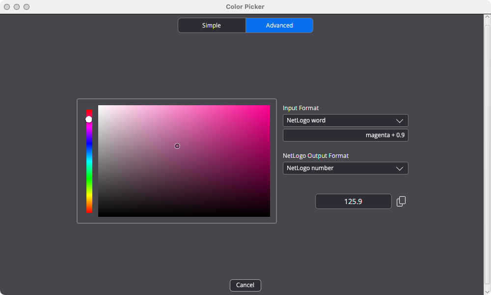
A powerful feature of the Advanced tab is that you can import colors using the following common formats RGB, RGBA, HSB, HSBA, HSL, HSLA and hexadecimal as well as NetLogo Number or NetLogo word. Use the Input Format pulldown menu to select the format and you will be able to set the appropriate value(s). The pulldown menu below shows the output options, which have the acronyms above spelled out. There follow two examples of specifying an input. For a NetLogo word there is a text field. For HSB (Hue, Saturation, Brightness) there are three numeric fields. The color selected using the Input format can then be modified by using the hue slider, transparency slider or the palette rectangle.
In this example the input is a NetLogo word.
In this example the input is HSB.
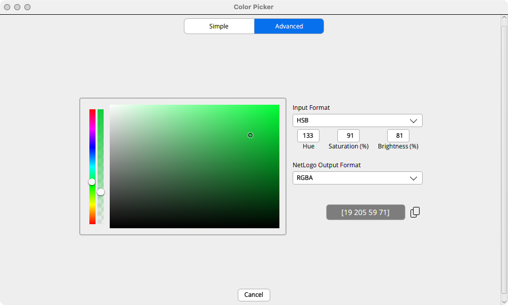
The color that results after any adjustments can be output in the selected Output Format. The full list of output formats is NetLogo Number, NetLogo word and RGBA (Red, Green, Blue, Alpha). However in some contexts only a NetLogo Number can be output. As the user changes a color the value of the Input value is updated. In the image below it was initially lime - 0.3, but changed to lime - 0.6
For the Color Input and plot pen colors the output format is a NetLogo number. Transparency is not supported for the Color Input in this release, but may be available in the future.
For Notes the output format is RGBA.
For the Tools menu Color Picker the output formats are NetLogo number, NetLogo word and RGBA.
There is no explicit RGB output format. However when you select “RGBA”, and your color is opaque (maximum alpha), the result is RGB format - a 3-item list (no alpha). Otherwise “RGBA” output produces a 4-item list (with alpha). In the example below you can see that the output is a 3-item list, because there is no transparency and RGBA output is selected.
Some users may want to skip this section on first reading. The “alpha” bar of the Advanced tab is used to adjust the transparency of a color. If neither the input format nor the output format allows transparency the alpha bar will be hidden. The formats that do not allow transparency are: NetLogo number, NetLogo word RGB, HSB, and HSL. If the input supports alpha, but the output does not, the output dropdown will be highlighted and will have a tooltip that explains that the output color will be opaque. The first example shows the case where there is no alpha bar. The second example show the highlighted output because there is transparency, but an opaque output format.

Notifications
When the NetLogo team sends out a new notification message a banner will appear below the Interface Toolbar with a brief message. If you click on the button you will go to a web page that gives the full information of all messages to date in reverse chronological order.
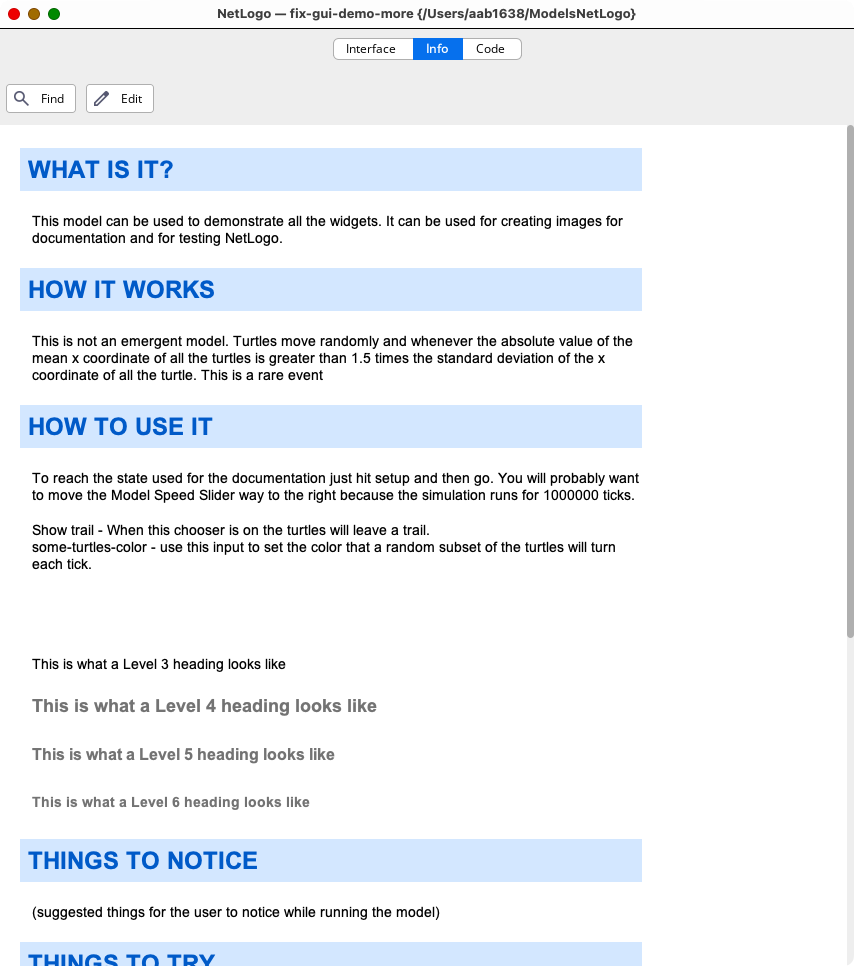
The changes to the Info Tab are purely visual. The Find and Edit icons and the section headers have been updated, as has the Help Icon that is visible when editing the Info Tab. The Info Tab Color Themes are shown below.
The colors code syntax highlighting have changed slightly for the Light Color Theme, and there is now a Dark Color Theme.
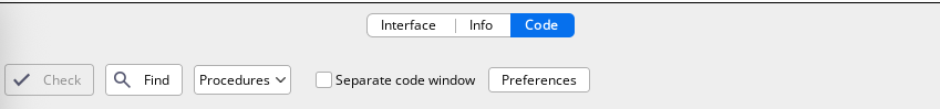
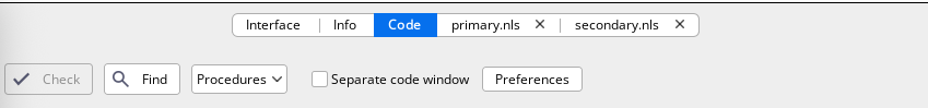
The Code Tab toolbar features new icons. Some preferences are now settable through the new Code Tab preferences dialog.
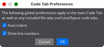
This dialog can be used to set global code tab preferences. “Auto indent” previously used a checkbox on the Code Tab toolbar. “Show line numbers” was previously part of the overall Preferences Dialog.
When an included (.nls) file tab is selected it becomes blue. An included file tab is closed by clicking on the “x” on the right side of the tab. (Previously the close button was in the toolbar.) An included file tab includes a checkbox to open it in a separate code window, and a Preferences button, which work as they do for the main Code Tab.
This dialog lets you customize various NetLogo settings. On Windows and Linux, it is opened with the Tools menu “Preferences…” item. For Macs, it’s under the “NetLogo” menu and reads “Settings”.
NetLogo 7 includes some new NetLogo settings, and is reorganized to place related items in proximity.
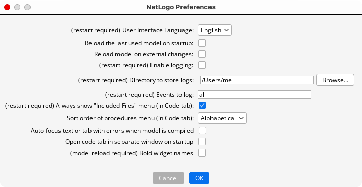
Use the check boxes or pull-down menus to change the default preference values. When you are done, click the OK button to save your changes, or the Cancel button to revert the preferences to the state they were in before you opened the dialog. Most preferences take effect imconvertguidetely. You must exit and re-open NetLogo for the preferences that indicate “(restart required)” to take effect. There is one preference that only takes effect when the user opens a new model, or re-opens the current model, as indicated by the note “(model reload required)”.
Here is a brief description of the new and changed preferences.
Reload model on external changes: If you use an editor outside of NetLogo to change the model or any included .nls files the model will be reloaded.
Enable logging: Create a log file containing user actions. This option can be useful for teachers.
(restart required)
If logging is enabled and a log directory is not specified by the next preference the error message “Logging was enabled, but no log directory was specified.” will appear.
Directory to store logs: Specifies the directory to which log files will be written. You can type in the directory name, or select a directory using the Browse… dialog.
(restart required)
If logging is enabled one of the following may happen.
If you type in a non-existent directory you will see a dialog that says “The specified log directory does not exist, would you like to create it?” with options “Yes” and “No.”
You must have write permission for the log directory, otherwise you will get the message “NetLogo does not have permission to write to the specified log directory.”
Auto-focus text or tab with errors when model is compiled: If checked, NetLogo will bring you to the location of an error if one occurs during compilation.
Open code tab in separate window on startup: When checked the Code tab will appear in a separate window when NetLogo is opened.
Bold widget names: By default, widget names are not in bold, use this option to make them bold.
(model reload required)
UI Scale: This option is for Linux only. It must be set to the same value as your system UI scale or NetLogo will fail to resize its visual components correctly.
Entering an improper value will produce the error message “UI Scale must be a valid floating point number.”
The “Show line numbers” preference is now part of the Code Tab Preferences Dialog.
This dialog allows you to view, add, or remove files that are bundled with the current NetLogo model. These files can be read during a model run using the Resource Extension (see the documentation page for the extension for more details).
The new menu items ‘Color Themes’, ‘Color Picker’ and ‘Convert Widgets to New Sizes’ have been described in earlier sections.
The menu item ‘Color Swatches’ has been removed.
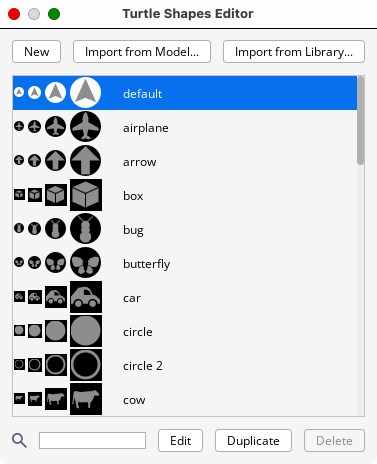
The Turtle Shapes Editor and the Link Shapes Editor have been updated, as described below.
The Turtle Shapes Editor now has some buttons near the top, for easier use. A search field has been added so users can quickly search through the model’s collection of turtle shapes.
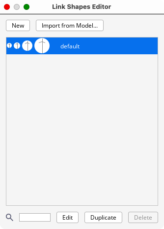
The Link Shapes Editor now has some buttons near the top, and a search field.
The Help Menu now has a link to the NetLogo Forum, a website to ask/answer questions and have discussions about NetLogo.