ProbLab
NetLogo Models
Main Page, Papers & Publications, Models
This is a collection of models authored in the NetLogo modeling and simulation environment. They are all part of ProbLab, a curricular unit designed to enrich student understanding of the domain. For more details, please see the model itself in the NetLogo library.
Central Limit Theorem
Population distributions, sample-mean distributions. See more.
Central Limit Theorem demonstrates relations between population distributions and their sample mean distributions as well as the effect of sample size on this relation. In this model, a population is distributed by some variable, for instance by their total assets in thousands of dollars. The population is distributed randomly -- not necessarily 'normally' -- but sample means from this population nevertheless accumulate in a distribution that approaches a normal curve. The program allows for repeated sampling of individual specimens in the population.
Combinations Tower
Classroom collaborative combinatorics construction See more.
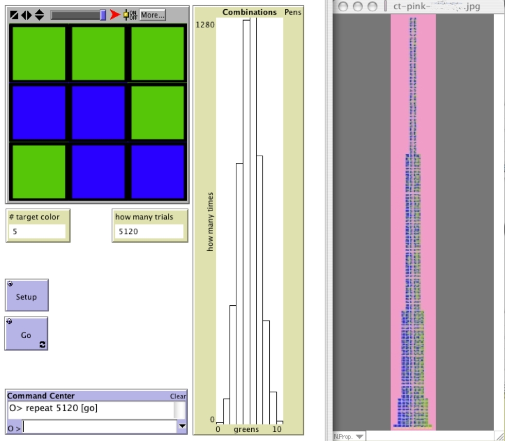
The Combinations Tower is the collection of all possible permutations of the green/blue 9-block. These permutations are grouped by combinations, that is according to the number of green squares in each 9 block (0, 1, 2, 3, 4, 5, 6, 7, 8, and 9 green). These unique permutations are placed one above the other. The heights of the Combinations Tower's respective columns, counted in 9-blocks, is the sequence of binomial coefficients for (a+b)9, that is: 1, 9, 36, 84, 126, 126, 84, 36, 9, and 1. The Combinations Tower becomes a classroom resource for referring to elements in subsequent activities in the ProbLab unit. For instance, in the SAMPLER statistics activities, one can refer to sample means, e.g., 2/9 green or 8/9 green, in terms of their left-right "location" in the tower, and one can refer to sample-mean distributions as compared to the quasi-normal distribution of the tower. Thus, the tower supports the classroom co-construction of the semiosis of the domain -- the tower helps bring together the unit's three conceptual pillars: theoretical probability, empirical probability, and statistics.
It is no simple task for a middle-school classroom to build the Combinations Tower. Individual students use inductive, deductive, recursive, and pattern-finding algorithms to determine the heights of the columns and to generate the permutations. There is a great deal of work to accomplish, and resources are limited. So students need to distribute the work to task forces. The biggest challenge is avoiding repeated permutations. So the mathematical construct of distribution is grounded in terms of classroom agents, labor, and product. The Combinations Tower that students engineer and build becomes associated with probability when explored through the NetLogo models, such as 9-Blocks . The combinatorial space is distributed in a form that anticipates the frequency distributions in empirical experiments. Reciprocally, the distribution resulting from the experiment lends new meaning to the actions of performing combinatorial analysis. That which was essentially a collection of all different permutations now becomes a representation of the relative ubiquity of classes of objects in the world.

Dice
Empirical probability with a familiar object See more.
Dice is a virtual laboratory for studying fundamental probabilistic aspects of a classic pair of dice, each with 6 sides. The model simulates randomly rolling dice and uses statistical analytic tools to make sense of data accumulated over numerous rolls.accumulate in a distribution that approaches a normal curve. The program allows for repeated sampling of individual specimens in the population.
How to use this model: Press SETUP, then press PICK DICE. By clicking on the green squares, you set a pair, for instance [3; 4]. Press SEARCH to begin the experiment, in which the computer generates random dice face. If you set the SINGLE-SUCCESS? switch to 'On,' the experiment will stop the moment the combination you had created is discovered. If this switch is set to 'Off,' the experiment will keep running as many times as you have set the values of the SAMPLE-SIZE and TOTAL-SAMPLES sliders. In the plot window, one or two histograms start stacking up, showing how many times the model has discovered your pair in its original order ("Combination") and how many times it has discovered your pair in any order ("Permutations"). Are there always more permutations than combinations?
Dice Stalagmite
One die, two dice, and outcome distributions See more.
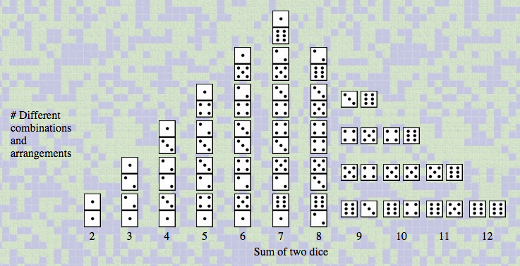
Dice Stalagmite is a model for thinking about independent and dependent random events. In this model, outcomes from two independent events -- the rolling of "Die A" and "Die B" -- are represented in two different ways. On the left you see these outcome pairs plotted as individual events -- this representation ignores the fact that the two dice were rolled as a pair and just stacks each die outcome in its respective column within the picture bar chart. On the right, you see the same two dice accumulating as pairs. Note that the bar chart on the left has only six columns: 1, 2, ...6 -- one for each possible die face. The chart on the right has 11 columns -- 2, 3,...12 -- because it groups outcomes by total, and there are eleven possible totals (the columns are broader, because they must accommodate two dice). Below is the combinatorial space of all possible pairs of dice grouped in eleven columns according to their total (2, 3,..., 12).
As in other ProbLab activities, we care for exploring relations between the anticipated frequency distribution, which we determine through combinatorial analysis, and the outcome distribution we receive in computer-based simulations of probability experiments. To facilitate the exploration of the relationship between such theoretical and empirical work, we build tools that bridge between them. These bridging tools have characteristics of both the theoretical and empirical work. Specifically, we structure our combinatorial spaces in formats that resemble outcome distributions, and structure our experiments so as to sustain the raw data (not just graphs representing the data).
Equidistant Probability
Connecting geometry and stochastics See more.
Equidistant Probability is perhaps an unusual model -- it bridges two domains of mathematics that are seldom found on the same page: geometrical analysis and probability. Say you have selected three vertices and have arranged them so that they flank a single square (e.g., Preset3). Slow down the model, using the slider on the top-left corner of the graphics window, and watch closely what happens when you press FIND EQUIDISTANT POINT. From each of the three vertices, a single turtle darts forward in some random direction. The turtles walk in discrete steps of a size that is equal to the side of a square. If all three turtles land on the same spot, then that spot is equidistant from their respective points of departure. The diagram, below, helps compute the chance of each turtle landing on a square that is neighboring its own square. The collection of all points that a turtle can land on when heading at a random direction and stepping forward 1 step describes a circle of radius 1 step. Geometrical analysis of arcs of this circle that lie in neighboring squares shows that the arc is 1/6 of the circle. So the turtle has a 1/6 chance of landing on each of the four North/West/South/East neighbors. 4/6 are 2/3, so 1/3 is left to share between the four corners. So the turtle has a 1/12 chance of landing on each of the four corner neighbors. Your three turtles each has a 1/6 chance of landing in the square their vertices enclose. To determine the likelihood of the compound event when all three turtles each got just that 1/6 of a chance, we multiply the three chances. 1/6 * 1/6 * 1/6 is 1/216. So once in every 216 attempts, on average, all three turtles will land on that square. Run the experiment under these conditions and see if you get a mean of 216 attempts until success.
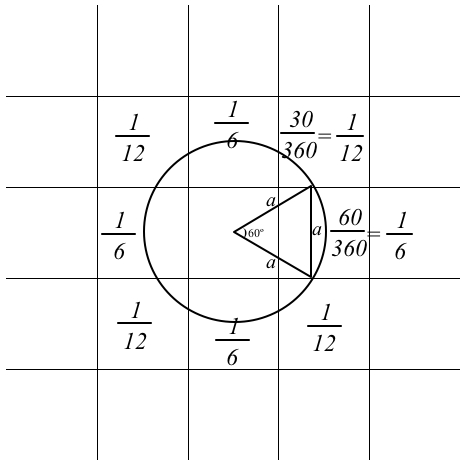
The EPICENTER module (bottom-left corner of the interactive model) uses brute force to compute the chances of a single turtle landing on some square. From the central square, 10,000 turtles emerge. Their orientation is distributed quite uniformly. Then, all at once, the turtles perform a synchronized swim 1 step forward. The squares where the turtles land each record how many turtles landed on them. This information is displayed by default as a percentage of all landings, but you can change the 'choice' button so as to see the number of landed turtles instead. Use this module to cross-check the diagram. With paper, pencil, straightedge, and compass, you can try extending the diagram to determine if you have understood well the geometrical analysis. In NetLogo, this model can be easily extended so as to include more squares and allow the turtles to walk more steps. The richness of such extension possibly trades off with a multitude of data that makes for challenging computation.
You can read about the building of this model in this paper.
Expected Value
Supplementing simple empirical-probability simulations with 'worth' See more.
The analogy utilized for the model is one of a tiled playground, with a certain number of marbles beneath each tile (0, 1, 2, 3, 4, 5 or 6). [If you insist, this could be about eggs that the Easter Bunny has hidden, or any other idea...] The distribution of marble groups by number-of-marbles -- how many tiles have 0, 1, 2 ... or 6 marbles beneath them -- is set by the sliders on the left. So we know the chance of finding 0, 1, 2 ... or 6 marbles. For instance, the higher you have set a slider as compared to other sliders (see the % monitors), the higher the chance of finding that number of marbles beneath a tile. The more marbles underneath the tile, the lighter the tile color is. A wandering kid (the little person on the screen) flips up some tiles at every go and counts up the marbles found beneath the tiles. The kid cannot see the color of the tiles -- the colors are for us.
The idea of 'expected value' is that we can formulate an educated guess of how many marbles the wandering kid will find. It's similar to asking, "How many marbles are there on average under each tile?" We need somehow to take into account the chance of getting each one of the marble sets.
The computer program will do much of the calculations for us, but here's the gist of what it does: Let's say that the ratio units we set up were 0 : 1 : 6 : 5 : 0 : 4 : 0. The number '5,' for example, indicates our value setting for marble sets of exactly 3 marbles. You can see immediately that the chance of getting a '2' is greater than the chance of getting a '3, because the chance of getting a '2' has more ratio units than the '3'. But in order to determine just how big the chance is of getting each marble set, we need to state the ratio units relative to each other. We need a common denominator. In this particular setting, there is a total of 16 "ratio units": 0 + 1 + 6 + 5 + 0 + 4 + 0 = 16. Now we can say that there is a 4/16 chance of getting a 5-marble set. That is a 25% chance of striking upon a tile that has exactly 5 marbles beneath it. We can also say that these sets of 5 marbles contribute .25 * 5, that is, 1.25 marbles, to the overall average value of a tile in the playground. Similarly, we can say there is a 5/16 chance of getting a set of 3, a 0/16 chance of getting 6-marble set, etc. If we sum up all pairs of 'value' and 'probability,' we get:
(0 * 0/16) + (1 * 1/16) + (2 * 6/16) + (3 * 5/16) + (4 * 0/16) + (5 * 4/16) + (6 * 0/16) = 48/16 = 3 marbles per tile.
This tells us that on any single pick, you should expect to find on average 3 marbles. Thus, if you were to flip over 10 tiles, you should expect to find a total of 30 marbles.
Expected Value Advanced
Supplementing simple empirical-probability simulations with 'worth,' varying the sample size See more.
Expected Value Advanced studies expected-value analysis under the special condition that the sample size varies. This model extends the ProbLab model Expected Value, where the sample size is fixed.
The analogy utilized for the model is one of a lake with fish swimming around, each type of fish worth a certain number of dollars (1, 2, 3, 4 or 5) [other currencies or point systems apply just as well]. The distribution of types of fish by amount-of-worth -- how many $1 fish, $2 fish, ..., or $5 fish there are in the pond -- is set by the sliders on the left. The more fish there are of a particular kind, say the more $2 fish there are, the higher the chance of catching a $2 fish in a random sample. With the sliders, we can set the distribution of fish by type and, therefore, the chance of catching each type of fish. That is, the higher you have set a given slider as compared to other sliders (see the % IN POPULATION monitors), the higher the chance of catching a fish with that worth. Note that the more valuable the fish, the lighter its body color. You can press CLICK SELECTION and then click on the screen to "catch" a random sample, or press RANDOM SELECTION and have the computer program do the choosing for you. The computer selects randomly. You, too, can select blindly, if you turn the BLIND? switch to 'On.'
The idea of 'expected value' is that we can formulate an educated guess of the dollar worth of the fish we catch. It's similar to asking, "How much does the average fish cost?" We need to somehow take into account both the chance of getting each type of fish and its dollar value. The computer program will do much of the calculations for us, but here's the gist of what it does:
Let's say that the ratio units we set up for $1, $2, $3, $4 and $5 were, respectively, 1 : 6 : 5 : 0 : 4. The number '5,' for example, indicates our ratio setting for fish worth 3 dollars. You can immediately see that the chance of getting a $2-fish is a greater than the chance of getting a $3-fish, because the chance of getting a $2-fish has more ratio units than the $3-fish. But in order to determine just how big the chance is of getting each type of fish, we need to state the ratio units relative to each other. We need a common denominator. In this particular setting, there is a total of 16 'ratio units': 1 + 6 + 5 + 0 + 4 = 16. Now we can say that there is a 4/16 chance of getting a $5-fish. That is a 25% chance of catching a fish that is worth exactly 5 dollars. We can also say that this relative proportion of $5-fish in the lake contributes .25 * 5, that is, $1.25, to the mean value of a single fish in the lake. Similarly, we can say there is a 5-in-16 chance of getting a $3-fish, a 4-in-16 chance of getting a $5-fish, etc. If we sum up all products of 'value' and 'probability,' we get the expected value per single fish:
(1 * 1/16) + (2 * 6/16) + (3 * 5/16) + (4 * 0/16) + (5 * 4/16) = 48/16 = 3 dollars per fish.
This tells us that if you pick any single fish, you should expect, on average, to get a value of 3 dollars. If you were to select a sample of 4 fish, then you would expect, on average, to pocket (4 fish * 3 dollars-per-fish =) 12 dollars. Note, though, that the sampling in this model is of arrays, e.g., a 2-by-2 array of 4 squares. There are as many fish in this model as there are squares. One might expect to catch 4 fish when one samples from 4 squares. However, when the WANDER button is pressed, the fish wander randomly, and so sometimes 4 squares have more than 4 fish and sometimes they have less. You can think of each selection as a fishers' net that is dipped into the lake -- the fisher doesn't know how many fish will be in the net. This feature of the model creates variation in sample size. Thus, one idea that this model explores is that even under variation in sample size, we still receive outcomes that correspond to the expected value that we calculate before taking samples.
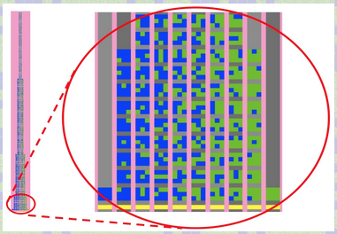
9-Block Stalagmite
Bridging combinatorial sample space and distribution of empirical outcomes See more.
Samples are generated randomly and then drop down into a column that reflects the number of green squares in the sample. For instance, a sample with exactly 4 green squares (so 5 blue squares) will "travel" to the column that has a "4" at the bottom, and then slide down the chute. You can control the size of the sample, and therefore of the combinatorial sample space of all possible samples of that size, with the SIDE slider. For instance, a setting of 'SIDE = 3' will give you samples of size 3-by-3, that is, a sample containing 9 little squares. We call this a "9 block."
Try running the model under the two possible settings of the KEEP-REPEATS switch -- 'Off' and 'On.' When the switch is on, samples will stack up even if they are repeats of samples beneath them in that column. When the switch is off, a repeat sample will vanish the moment it lands on the top sample in its column. You can toggle between building the combinatorial space per se (keep-repeats? off) and the experiment (keep-repeats? on) of randomly generating samples and watching how the distribution roughly replicates the shape of the combinatorial space. Note that in the interest of viewing convenience, the graphics for this applet have been set to a size that cannot accommodate the entire sample space for SIDE that is bigger than 2. If you have downloaded NetLogo, you can adjust the size of the graphics window in this model.
9-Block Stalagmite is a rich model that can serve as a kick off for conversations pertaining to key ideas in the domain. For instance, for settings of 'probability = 50%,' 'SIDE = 2' (4-block samples), 'KEEP-REPEATS? Off,' and 'STOP-AT-ALL-FOUND? On,' the model will run until it has found all 16 permutations of the combinatorial space. But...
Perhaps the most interesting relation to explore in 9-Block Stalagmite is between the setting of 'probability' and the mode in the histogram. Why is it that the mode is in the column around p*N'? Consider the case of 'SIDE = 2,' that is, the 4-block. It is pretty obvious that for a setting of probability-to-be-target-color = 0, we'll get a mode of 0 green -- every square will always be blue, and so every single 4-block will be completely blue. Likewise, we'd be surprised if a probability-to-be-target-color = 100 did not give a mode of 9 green -- all 4-blocks are completely green. But what about probabilities in between 0 and 100%? That's where it gets fuzzy. But fascinating, too. Setup the model with the SIDE at 2 and the 'probability' at 70%. Press Setup and then Go. Note that the %-target-color tends to 70%. Also note that more sample combinations collect up in the column of 3 green patches than any other column. So '3' is the mode. We have found it interesting and perhaps somewhat confusing to shift between thinking about the 'mode' and thinking about the 'mean.' For instance, if you set the PROBABILITY to 83%, you might think that since 83% of 4 is 3.32 then the mode should still be '3.' Is it? What is going on here? So for some probability setting, the 3-column will most often get to the top before other columns. For other probability settings, the 4-column wins. Try to determine the probability ranges in which each column "rules." Is this trivial?
We believe that this phenomenon is only ostensibly obvious. The compelling match between .70 chance at the micro level of each square and .70 at the macro level (see the %-target-color monitor) may hide the inherent complexity of the situation. The micro-to-macro congruence indexed by the near overlap between parameter settings and experimental outcomes deceivingly suggests a certain closure. That is, the micro-macro congruence may appear too trivial a connection to be stated, let alone explored. Yet, it is this micro-to-macro phenomenology that we wish to problematize. Such is the double-edged sword of computer-based models (see Abrahamson, Berland, Shapiro, Unterman, & Wilensky, 2004): For learners who are not fluent with designing computer-based experiments and authoring and modifying code, computer environments and, specifically, computer-authored and run simulations, implicitly signify an ineluctable authority. Moreover, the input-output fit lends a 'makes sense' feeling that dis-invites further inquiry. At best, the learner might remain with a superficial insight into a relation, but never begin to ask hard questions concerning the why and how that underlie this relation. We are currently working on various activities both to evoke student interest in this central phenomenon of probability and to help students understand -- both at an intuitive and formal level -- why/how this phenomenon obtains.
9-Block Stalagmite Solo
Companion to Sample Stalagmite for building combinatorial-analysis strategies See more.
9-Block Stalagmite Solo is your opportunity to build up the combinatorial sample space of all the possible arrays of 3-by-3 squares, in which each square can either be green or blue. What is your strategy? In 9-Block Stalagmite, we discuss some strategies. Note that due to the large size of this sample space, it was not possible to fit it all in without requiring lots of scrolling up and down. However, this applet should allow you to figure out how to create many 9-blocks without repetition and without skipping any along the way. This skill will help you when you participate in the HubNet version of 9-Block Stalagmite, in which you compete against other participants.
9-Blocks
Single and compound events as complementary perspectives on combinatorial sample space See more.
In this model, each square is either green or blue on every trial. The model counts up how many squares are green (the "target color") and the histogram plots how many times we got each number of greens, between 0 and 9. For instance, if your sample has 5 green squares, the '5' column in the histogram will grow a bit.
The "9-Blocks" model helps us shift between two complementary interpretations of the 9-block (the 3-by-3 array of green/blue squares). When the ONE-BY-ONE-CHOICES? switch is set to 'On,' we can think of each color square as a green-or-blue "coin" that settles either on green or blue. In that sense, the 9-block is a set of 9 individual independent events, and we are taking samples of n=9 from a "population" of coins that have either 'green' or 'blue' as their value for the property 'color' that we are measuring ('green' is our arbitrarily chosen favored event or "target color," and the histogram reflects this decision). This is a "population" -- with quotation marks -- because it doesn't really exist until we generate the random sample. Compare this to SAMPLER, where the virtual population exists before we take the samples.
The complementary interpretation of the 9-blocks is as a compound event. There are 512 different permutations of the 9-block (see the Combinations Tower page). The histogram organizes these permutations according to the combinations. For instance, all events of 9-blocks that have exactly 5 green squares are accumulated in the '5' column. So the histogram is showing us the frequency distribution of 9-blocks according to a particular classification that we chose (there could be other classes, such as based on types of rotational symmetries or if the patterns describe letters of the alphabet, etc.). Unlike in 9-Block Stalagmite, the 9-Blocks model does not show the actual samples in the histogram. It is more like the histograms that learners will encounter out of the ProbLab environment. Students who have worked on the Combinations Tower may have intuitions as to why the 4-green and 5-green 9-blocks occur most often in the 9-Blocks model. Young students who have noted the higher frequency of the 4- and 5-green 9-blocks or who have noticed the similarity of the histogram to the Combinations Tower have said, "It's because there are more of those in the world to choose from." Figure 1, below, shows how the 9-Blocks model can be used in conjunction with the Combinations Tower -- the tower that students build in the classroom -- and/or images from the 9-Block Stalagmite model.
Partition Permutation Distribution
Frequencies of possible addends of given totals See more.
In how many different ways can you add up to 20? Well, there's just [20], then there's [19 + 1], [18 + 2], [18 + 1 + 1], [17 + 3], [17 + 2 + 1], [17 + 1 + 1 + 1], etc. all the way to [1 + 1 + 1 + 1 + 1 + 1 + 1 + 1 + 1 + 1 + 1 + 1 + 1 + 1 + 1 + 1 + 1 + 1 + 1 + 1], and that's without caring for the partitions' order. If we figured out all the different combinations, which number would occur most often? It looks like '1' wins easily. But how ubiquitous is it? How many more '1's are there as compared to, say, 7's? This model randomly generates many partition combinations of a target-total. If enough combinations are generated, the shape of the graphs stabilizes to show the relative frequencies of the addends.
Note that the sample space out of which the simulation selects randomly is NOT the space of all possible partition combinations. If it did so, then the combination [20] would be as likely to occur as the combination [1 + 1 + 1 + 1 + 1 + 1 + 1 + 1 + 1 + 1 + 1 + 1 + 1 + 1 + 1 + 1 + 1 + 1 + 1 + 1]. Rather, each addend is drawn independently. The simulation chooses randomly out of the space of integers between 1 and the target-total, for instance, out of the space 1, 2, 3,..., 20. So, whereas the chance of getting a [20] is 1/20, there is a ridiculously low chance of getting the long string (the chance is 1/20!, so please don't stay up waiting for this to happen).
Note that under the default setting of the model, the addend is drawn from an ever-diminishing space (the switch DIMINISHING-SAMPLE-SPACE? is "On"). For instance, once '13' is drawn randomly from the sample space of integers between 1 and 20, the next draw is from the range of 1 through 7 (the remaining difference to 20). Under the alternative setting of this model (DIMINISHING-SAMPLE-SPACE? is set to "Off"), the model will ignore the remaining difference up to the target total. For instance, once it is at 13, going on 20, it will select from a range between 1 and 20 and will keep dumping addends that are bigger than 7. These discarded choices do not become part of the sum, but the monitors and histograms keep a record of these choices as well as those that are kept in the sum.
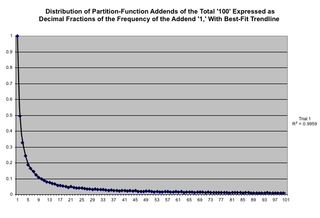
Riddle #1: If you run the experiment over many totals, with DIMINISHING-SAMPLE-SPACE? set to "On," an interesting relation emerges between the heights of adjacent columns in the "ADDENDS" histogram (see Figure, above, representing 10,000 runs up to the total of 100). The second column is 1/2 as tall as the first column, the third column is 2/3 as tall as the second column, the fourth column is 3/4 as tall as the third column, etc. In other words, the second column is 1/2 as tall as the first, the third column is 1/3 as tall as the first, the fourth column is 1/4 as tall as the first, etc. This monotonic decreasing function, 1/n, behaves differently from the histogram in Shuffle Board, where we counted 'attempts until success' ("waiting time"). Can you explain why we get a '1/n' function here? Perhaps induction could help. (Solution)
Probability Graphs Basic
Three data-analysis perspectives on a randomly generated string of simple data See more.
Probability Graphs Basic offers three different perspectives on a string of outcomes from a single simulation of a probability experiment. In this experiment, numbers are chosen randomly from a sample space that you define. This sample space can range here from 1 to 10. At every trial, a number from this sample space is selected randomly and if it is '1,' then we have a 'success' (favored event). So the simulation produces a string of 'successes' and 'failures.' The top plot shows the running cumulative ratios between successes and overall trials. The middle plot shows the distribution of 'waiting time' from each success to the next. The bottom plot shows the distribution of successes in samples of size X, where your can determine X as well as the number of samples to be taken by using the appropriate sliders.
ProbLab Genetics
Demonstrates some connections between probability and the natural sciences See more.
ProbLab Genetics demonstrates some connections between Probability and the Natural Sciences. Specifically, the model frames a combinatorial space in terms of a genetic pool of fish. Fish vary by body and fin color, each of which can be either green or blue. Underlying this variation are dominant and recessive genes, expressed in "4-blocks." A "4-block" (see example, below) is a 2-by-2 array of squares, each of which can be either green or blue (see also 9-BLock Stalagmite). Initially, fish are randomly distributed by genotype, so if you add enough fish -- using the ADD FISH button -- they will be more or less equally distributed by genotype. Then, when you press GO ONCE or GO, the fish swim around, mate, and reproduce, and the distribution changes. The model allows you to look "under the hood": You can study a Mendel-type visualization of the combinations of dominant and recessive genes that underlie changes and trends in genetic distribution.
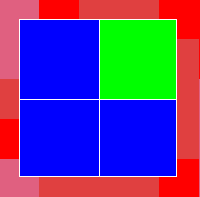
The top row of the "4-block" represents the body color of the fish, and the bottom row represents its fin color. Each row contains two squares, which represent the combination of genes that determine the phenotype of that fish. Green is the dominant gene for both the body and the fin color, whereas blue represents the recessive gene for those attributes. Thus, a green-green top row makes for a green body color and so does green-blue and blue-green. Only a blue-blue top row would give a blue body color. The same applies to the bottom row, with respect to fin color. For example: the fish with these genes (in the "4-block" picture, above) would have a green body and a blue fin.
The fish swim around randomly. If at least two fish are on the same square (a NetLogo "patch"), they might mate, as long as they follow the pre-set mating rules (see the MATE-WITH chooser). When they mate, the offspring's genotype, both for the body color and the fin color, is built as a pair of squares - one from each parent. (For each parent, the procedure picks randomly between the left and right squares of each row.) Thus, it is possible for two fishes with green bodies to beget a blue-bodied fishlet. To view a fish's genetic code, press the REVEAL GENES button and then click on this fish. If you press on a mating fish (on a yellow patch), you will see the genetic code of both parents and of the offspring (who has already swum to a different place in the pool). This code will appear in the top white panel of the model as an "equation."
Use the LIFE-SPAN slider to control the number of "years," or time-steps, a fish lives. Note that for low life-span values, your fish population may deplete, and for higher values, the population might grow sharply but eventually arrive at an equilibrium, at a point that is determined by the life-span and mating rules. When the experiment runs, note that the monitors in the top-right corner show the number of fish by phenotype. The "Percent Fish by Properties" graph, too, shows the fish by phenotype, only this graph shows the percent of the fish with the four possible phenotypes out of all the fish in the pool. This graph helps us track changes in the population's make-up over the course of the experiment. Finally, there is a "4-Block Distribution" histogram. This histogram, unlike the other displays, deals with fishes' genotype. The histogram shows how many 4-blocks of each type there are (there are 5 types that are represented: 4-blocks with 0 green, 1 green, 2 green, 3 green, and 4 green squares). The little monitor in the top-right corner of this histogram, "Mean z," gives the mean number of green squares in the genetic material of the entire fish population. For example, if the population were normally distributed by genotype, the Mean z would be 2. That means that there would be 2 out of 4 green squares, on average, in the 4-blocks underlying the fishes' appearance.
Random Basic
Playground for exploring fundamental concepts of chance See more.
Random Basic was designed to focus learners on randomness, an issue that is naturally central to all ProbLab models. The basic sample space in 9-Block Stalagmite and 9-Blocks is just 2 -- green or blue are the only possible values for the property 'color,' in those models. So in those models the samples are made up either of green or blue events, and the sample space is "inflated" by considering compound events, such as blocks of 9 independent squares. In Random Basic, however, the space is generically larger. You may choose to work with a sample size of 2 by setting the SAMPLE SPACE slider to '2,' but you can also work in larger spaces (up to 100 in this version of the model).
Run the model and watch the creature deposit single square-events that are either green or red. Can you anticipate which column will hit the top first? Because the creature is building the columns one square at a time, there is absolutely no way we can predict which column will win when. The larger the sample space, the lower is our chance of guessing which column will win. It's totally, well, random. Or at least, pseudo-random. But we can make statements of a different nature: we can see trends in how, in general, the settings and the outcomes relate as we change the settings.
Random Basic Advanced
Exploring the effect of sample space and size on outcome distribution See more.
Random Basic Advanced extends on the ProbLab model Random Basic. In that model, there is only a single "messenger," the dart-shaped creature that builds up bricks. In Random Basic Advanced you can still work with a single messenger, but you can also work with 2, 3, or more. The model explores the effect of sample size on the distribution of sample mean. The larger the sample size, the smaller the variance of the distribution. That is, the sample space does not change, but extreme values become more and more rare as the sample size increases. Combinatorial analysis helps understand this relation.
Run the model with NUM-MESSENGERS = 1. Compare the histogram in the plot to the towers in the graphic windows. What do you see? Now setup and run the model with NUM-MESSENGERS = 2. Is the histogram any different from before? Repeat this for values of NUM-MESSENGERS 10, 20, and 30. For a sample size of 1, the raw data (the bricks in the towers) are exactly the same as the histogram. For a sample size of 2, we begin to see a certain shallow bump in the middle of the distribution. For larger sample sizes, this bump becomes more and more acute. For a sample size of 30, the distribution is narrow.
Random Combinations and Permutations
Create a combination of color or dice and search for its permutations See more.
Random Combinations and Permutations invites you to set up a secret combination and then see how long it takes the computer to find it. That's when SINGLE-SUCCESS is set to 'On.' Follow the instructions at the top of the model applet. If you set SINGLE-SUCCESS to 'Off,' then the program will keep track of how many times or how often it finds the combination. The histogram grows to show you how many times the combination is found out of each sample of 1,000 attempts. You can change the size of the sample, and you can change the histogram to a graph. Also, you can work with dice instead of colors. You can even change the height and width of the array to work with more or less squares. There is a multiple-choice widget called ANALYSIS-TYPE This controls whether or not we care for the order of the colors or the dice in the combination you created. For instance, if you create a dice combination "1, 2, 3," then if ANALYSIS-TYPE is set to "Combinations," only "1, 2, 3" will be accepted as a 'find.' But if ANALYSIS-TYPE is set to "Permutation," then "3, 1, 2" will be accepted as a find. So will "1, 3, 2" (what else)? In any case, the program keeps track of how many times it finds the combination in the correct and in the incorrect order. So what does that multiple-choice button do? It governs whether or not you'll see these results being plotted. If you set the choice button to "Both," then both types of event will be recorded.
S.A.M.P.L.E.R.
A HubNet participatory simulation in statistics See more.
S.A.M.P.L.E.R., Statistics As Multi-Participant Learning-Environment Resource, is a group activity. The applet is a stripped-down version of the 'server' -- what all participants see projected on a large screen. It has been stripped down to key interactivity features both so as to fit in this window and so as to cut to the core of the design. For further details, please refer to the NetLogo library where you can also download the model. For detailed suggestions for how to facilitate S.A.M.P.L.E.R., please consult our Computer-HubNet Guide.
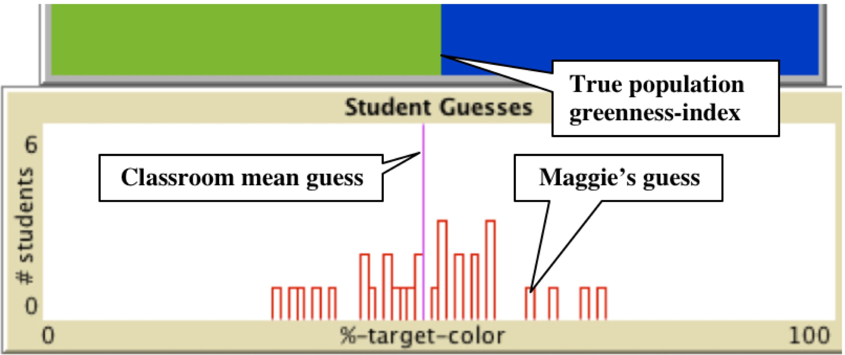
The objective in this model is to determine, through sampling, the greenness of the population. That is, if you were to pick a single tiny square from this "population" of thousands of green-or-blue squares, what is the chance that this square comes out green? Press on 'Sample,' and then click on the graphics window. Using the appropriate slider and switches, you can change the size of the sample with the sample-block-side slider, you can add a grid, and you can keep your samples. In the classroom, each student has their own computer interface from which they make their individual selections of samples. Then they input their guesses. Click on 'Simulate Classroom Histogram' to get a sense of how these guesses might look once they are processed by the central server.
Working with middle-school student in S.A.M.P.L.E.R. has been very exciting. See our publications for some reports, analyses, and feedback. S.A.M.P.L.E.R. is much richer than we can convey in this forum -- it includes many game-full activities that draw in students' intuitions and mathematical skills and build on these towards creating a meaningful context for asking difficult questions about statistics, questions that help students reason about the domain and develop deep understandings. We hope we can help you make S.A.M.P.L.E.R. happen for you, too!
Shuffle Board
Fresh visual metaphor to explore 'waiting time' and 'streaks of success' See more.
Shuffle Board simulates an experiment in which a bounded number of elements with a fixed proportion of favored events is repeatedly shuffled. Here there are 121 candy boxes, and only some of them -- according to your setting of the slider AVERAGE-DISTANCE -- have prizes inside. If you set that slider at 5, then every fifth candy box, on average, will have a prize. In fact, if you press Setup, then literally every fifth bottle will have a prize, counting from the top left corner, running all the way to the right, then skipping down to the second row, and so on. The numbers in the "prize boxes" represent how many boxes had to be bought since the previous prize. The plots show two statistics: One plot, Frequency of Distances to Prizes, keeps accumulating the frequencies of runs since a previous prize to the next prize (as represented by the numbers on the prize boxes); The other plot, Frequency of Streaks by Length, shows how many times we have received single successes, a pairs of successes, a success triplet, etc. The COLUMNS FACTOR helps us look at the ratio between the heights of adjacent columns in the plot immediately above it. For instance, the value of .8 would mean that on average, each column is .8 as tall as the column to its left. You can use the slider TRUNCATE AFTER COLUMN to determine how many columns you want to include in this average.
Stochastic Patchwork
Normal distribution as macro perspective on micro chance See more.
The %-TARGET-COLOR slider controls the probability of each square to be green, and the histogram shows the distribution of sample means. If a sample is completely green, the histogram will register a rise over the x-axis value '100%.' If 4 out of 9 squares are green, the histogram will register a rise over the x-axis value 100 * 4/9, that is at about 44.4%. What is the relation between the histogram and the %-TARGET-COLOR? This relation is deceivingly simple, due to the arrangement of the interface elements. Note how the probability slider neatly subtends the x-value of the plot. While the experiment is running, drag the probability slider and observe the shape of the distribution. One literally feels that one is dragging the histogram. However, this "mechanical" maneuver enfolds the deep relation between the 'micro' and the 'macro' in the domain of probability: The slider controls the probability of each square to be green, but the histogram shows the overall distribution of sample means taken from successive compound events.